
This is the fourth part in a five-part series. You should read the first part first, the second part second, and the third part third.
In this series, we're discussing just how to promote a more positive user experience and overall design through better website content organization.
The first part of the series covers the first step in the process: Inventory. You can check that post out here. In it, we introduce you to some of the tools and approaches you’ll need to get a full view of your website as it exists today. We also provide you with a free content audit template to get started.
The second part of the series talks about the second step in the process: Exploration. You can read that post here. In it, we show you how to identify any unfulfilled audience needs and desired content types not currently utilized on your website. Through the inventory phase, you were able to gain a good idea of what currently exists on your site. The exploration phase can help you to determine if you’re actually meeting your users’ needs.
In the third part of the series, covering the Clean phase as defined by Anthony D. Paul, the goal was to get rid of things on the website that are unnecessary, expired or broken and whittle down to just what needs to remain. The outcome of this phase were notes and simple updates to your content audit spreadsheet. You can find a template for that here. In this phase, we learned that while simplicity is important, redundancy can be a great thing. In fact, in the specific context of higher education, redundancy is extremely important and necessary when it comes to accessibility. To learn more about smart redundancy, be sure to read this post.
Part 4: Decide
Now in the Decide phase, it’s time to determine what is most important through various sorting methods and interactive team activities to prioritize your site elements and accommodate various user journeys. We’ll finalize the content audit and discuss some of the other Discovery and audit deliverables. Let’s get started!
Decision-Making Tools, Sorting Methods & Deliverables
Card Sorting
We talk and write about Information Architecture a lot here at DrupalAnswers. Information architecture, according to expert Abby Covert, is how we arrange the parts to be understandable as a whole. It is the practice of deciding how to arrange those parts with the intention of getting across a certain type of information to our users.
Card sorting can be useful for sorting all those ‘parts’ (be it content, goals, objectives, etc.) of a site into meaningful categories. This is one method we use to organize the requirements we collect and cluster those needs, features, requirements, issues, limitations and opportunities into like-categories or groups. We also use this method to facilitate naming, prioritizing, scoping and planning activities.

Thinking about information is hard. Card sorting can be especially useful for the purposes of structuring your website because it is a collaborative exercise that allows us to dig into the complexities and generate ideas, probe problems, identify patterns and make decisions.
The Great Power of Sticky Notes
As Kate Rutter of Adaptive Path puts it, stickies are the currency of ideas. They’re cheap and easy to move about, the right size to capture one idea or problem, and they enable us to both focus on one thing at a time and visualize patterns, relationships and agreements. You can conduct card sorting tasks and activities using index cards or sticky notes (or Post-It Notes), as these are both simple tools that deliver great results.
If you don’t have a big wall for the stickies, use a window or the back of a door. Gather your team and enough stickies and markers to go around. Display the objective of the card-sorting activity clearly where everyone can see and reference it.

Here are some questions we often consider during this activity:
-
What should the website do?
-
What features and functionality need to be built for the site to be successful?
-
What is the deeper purpose of a feature on the site?
-
Why is this feature needed or important?
Start by independently writing down your ideas. Include one thought or idea per note. This method of quick freelisting can get issues out, make ideas visible and open up topics for discussion. You can then discuss and uncover new perspectives, insights and observations.
Other activities you can conduct include arranging these ideas into categories, clusters, trees, information or process maps, and action plans. You can learn more about various sticky note methods in Kate Rutter's Becoming a Stickynote Ninja: The Problem-Solving Power of Stickies.
The goal of these activities would be to generate & capture ideas, prioritize and dive deeper on the best ideas and patterns.
Distributed teams can benefit from digital tools that facilitate card-sorts or usability tests:
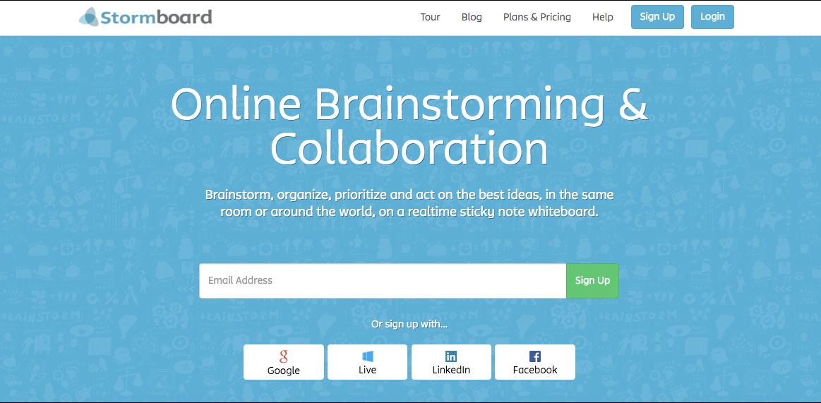
Stormboard
Stormboard is an online brainstorming and collaboration tool. Brainstorm, organize, prioritize and act on the best ideas, in the same room or around the world, on a realtime sticky note whiteboard.
As a team, and in real time, you can quickly generate and capture ideas by adding sticky notes, photos and videos to a shared wall. All ideas have a comment thread allowing your team to clarify, debate and refine ideas further. This gives you both better ideas and captures the discussion for future reference or debate. Prioritize ideas with ‘dots’ or votes and dive deeper on the best ones.
Stormboard also features instant innovation reports, templates, and data export capabilities. Save time by exporting everything to a spreadsheet that can be used later in the decision-making process.
Optimal Sort
Optimal Sort is another online card sorting tool used by information architects, web designers and content writers use to discover how other people think your content should be organized and get the user insights they need to make informed information architecture decisions.
Use Optimal Sort to set up a survey where users and decision makers can organize your site content into clusters. You can conduct remote, unmoderated or moderated user testing to get quantitative data quickly and gather key insights. Create an open card sort where participants create and label their own groups, or a closed card sort where you predefine the groups. Participants will complete your card sort online, by organizing your “cards” into groups that, for them, make sense and belong together.
If you have a medium to large website, intranet, online shop or knowledge base then you will benefit from using OptimalSort. Card sorting will help you to understand the product groups or categories that customers would sort items into and thus where they'd expect to find them in your navigation menu structure. This is hugely beneficial in the decision-making process.
Like Stormboard, you can download your raw data and use them later on in your spreadsheets. You can also visualize the data and share the results with co-workers, clients or friends or restrict access to keep all your data secure.
Five Hat Racks
It may seem like there are a million ways to organize your information when in reality, there are really only five ways to do it. Think LATCH:
-
Location
-
Alphabet
-
Time
-
Category
-
Hierarchy
You can read more about each of these ways of organizing information in this post by The Visual Communication Guy.
And, if you need even further information or inspiration on how to organize your information, you can turn to this useful, slightly obnoxious Five Hat Rack video for inspiration: https://youtu.be/Tgi1JQGHENI.
Users are often confused when our internal jargon and categories end up in our navigation taxonomies. Content should be organized in ways that the end-user understands it, and often we find that’s not the case as the institutional website exists today.
The cure for this is simple. If you currently organize by department, try organizing by task or audience instead. Try at least two new ways before deciding which way to go.
As Abby Covert says so brilliantly, "It turns out that the organization of things is only correct insofar as it helps you reach your intention that you set for whatever it is that you’re making.” In other words, truth of organization has no place here - it’s a matter of perception. There is no right way of organizing anything. The only thing that matters is reaching your goals.
Your website can be arranged and designed in a way that invites users to stay and browse for a while, or it could be architected to get them to pick up the phone. What do you want people to do and believe to be true when they’re done with the experience you’ve given them?
In considering this question, keep in mind the roles and personas and use cases you identified in the earlier steps of this process to reduce distractions and prioritize your information.
Flow Document
After you’ve identified the best ways to organize your site content, you’ll want this information translated into a flow document. Flow documents and diagrams are often used to map out the content structure of a site
Flow or site diagrams can range from simple hierarchical “org chart” diagrams to more complex and information-rich maps that show both the major divisions of the site as the user experiences them, but also act as an overview of the site directory and file structure. The well-known information architect Jesse James Garrett developed a widely used visual vocabulary for site diagrams that has become the de facto standard, and the symbols are broadly useful for portraying site structure and interactive relationships and user decision points

Jesse James Garrett’s visual vocabulary for site design diagrams.
Major elements of a mature site or flow diagram will include:
-
Content structure and organization: major site content divisions and subdivisions
-
Logical functional grouping or structural relationships
-
The “click depth” of each level of the site: How many clicks are required to reach a given page?
-
Page type or template (menu page, internal page, major section entry point, and so on)
-
Site directory and file structure
-
Dynamic data elements like databases, or applications
-
Major navigation terms and controlled vocabularies
-
Link relationships, internal and external to the site
-
Levels of user access, log-ins required, or other restricted areas
You can also use Google Slides to create a shareable interactive document.
Spreadsheets
At the end, you should also end up with spreadsheets with all of your site content (new and old) and a map of what the new structure should look like, and how to get there.
A good place to start is our Content Audit Template, which is you can download here. This spreadsheet can help you all the way from the Inventory phase and all throughout the decision making process.
We recommend conducting content audits and keeping up with these kinds of documents to:
-
Determine which pages on your site need to be updated and made more current
-
Prioritize content based on key metrics
-
Find content gaps and opportunities
-
Creating an inventory of content assets to help estimate the redesign and the content migration efforts
-
Understanding a client's content assets or information structure
-
And many more…
Be sure to include notes on URL redirects, merges and splits, new content and updates to existing content.
Click here to download your free Content Audit Template!
Stay tuned for Part 5: Validate
In this next phase, we validate the updated information architecture with key usability tests.
Contact us today for a free consultation. We look forward to working with you.
Want more? Sign up to get our monthly newsletter delivered right to your inbox. Receive links to the latest Drupal and Higher Ed-related articles, best practices and thought-leadership commentary
- Log in to post comments


This is a great article.
- Log in to post comments
Permalink